Radar DI Tricks & Tips
Introduction to Radar Chart
Radar chart is a graphical way to compare data by displaying data in a “web-like” form looking like spider web. So it is also known as spider chart/graph. Usually, it is applied to evaluate multiple alternatives based on multiple criteria.
INTRODUCTION
Radar charts, sometimes known as spider, start or web charts, are a two-dimensional chart type designed to plot one or more series of values over multiple common quantitative variables by providing an axis for each variable, arranged radially as equi-angular spokes around a central point. The values for adjacent variables in a single series are connected by lines, and, frequently, the polygonal shape created by these lines in filled with a colour. Beyond this there are many subtle variations that have different consequences with respect to the efficacy of the chart. These variations will be covered at appropriate points in the following critique.
Benefits of Using Radar Charts
Benefit 1: They provide a very easy way to see if someone is competent or not.
By overlaying multiple “webs” on a radar chart, you can do visual comparisons against reference data sets very easily. For example, you could compare a student to his classmates by overlaying the average radar chart from the entire class on top of his personal radar chart.
Benefit 2: They are great input in the development of learning plans
Weaknesses or strengths in performance are easy to see on radar charts. When someone is far above or below a standard, you will be able to observe a clear “balloon out” or “cave in” pattern.
This makes it easier for time-crunched advisors to find and address issues when they’re working with students. It also makes it easy to identify performers who stand out from the crowd. Those top performers may be able to help others in areas they are particularly good at. What is more, it may highlight trainees who should spend more time in training to catch up with other.
Radar Charts for Problem Solving
Radar charts are widely used in many fields, including education, business or other presentation. Here you can learn how to use a Radar Chart as a problem-solving technique, being especially useful in performance measurement. To solve a problem, sometimes you need to learn or analyze the problem comprehensively, through facts or figures. How can you dig out more useful information from the dry number? Radar chart is a great helper for you to make static data more meaningful and useful. It helps you compare and clarify so that you can see the differences and deficiencies. See how you can solve problems by radar chart through one real case.
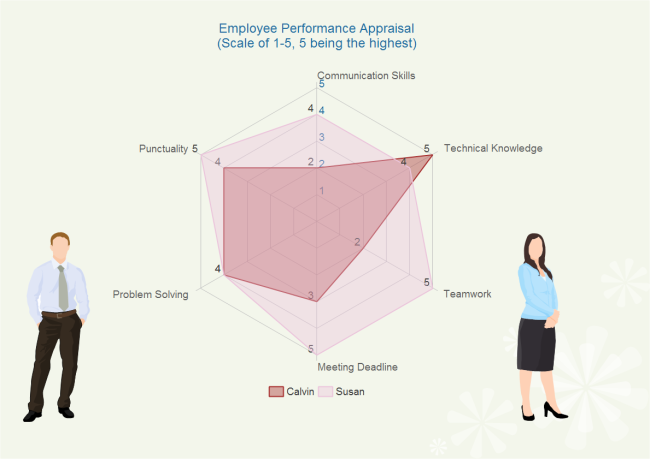
Problem Solving Example: Performance Evaluation Radar Chart

For this example, possible analyses might include:
- Susan is better in punctuality, communication skills teamwork and meeting deadline.
- Calvin’s technical knowledge is better than Susan.
- The largest difference is found in teamwork.
- Susan’s performance is better as a whole.
- Calvin ought to improve his soft skills to be more competent.
We have seen the data through Table and Bar chart. Now we calculate this data through Radar chart.
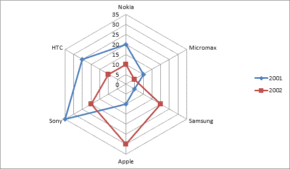
Number of mobile phones manufactured(in thousand) by 6 different companies in the years 2001 and 2002

As you can see Blue lines indicate year 2001 and Red line indicates year 2002.
Let’s Solve the problems.
1. In 2002,Which company manufactured the maximum number of Mobile Phones?
(a) Nokia
(b) Sony
(c) Apple
(d) Samsung
Solution:
From the Chart you can clearly see the maximum number of Mobile Phones manufactured by Apple in 2002= 30,000 , Answer C
2. What is the average number of Mobile phones (in thousand) manufactured by all companies taken together in 2001?
(a) 17.5
(b) 18.5
(c) 20
(d) 22
Solution:
In 2001 Mobile manufactured,
Nokia= 20000, Micromax=10000, Samsung=5000, Apple= 10000, Sony=35000,HTC=25000
Total=20+10+5+10+35+25/6=105/6=17.5 Thousand,
Answer A
3. The respective ratio between the number of Mobile Phones manufactured by Micromax in 2001 and that by Samsung in 2002 is ?
(a) 3 : 4
(b) 4 : 5
(c) 1 : 2
(d) 7 : 8
Solution:
The number of Mobile Phones manufactured by Micromax in 2001= 10000
The number of Mobile Phones manufactured by Samsung in 2002= 20000
Required Ratio= 10000 : 20000= 1 : 2,
Answer C
4. The difference between the number of Mobile Phones manufactured by Nokia, Micromax and Samsung in 2001 and that by Apple , Sony and HTC in 2002 is ?
(a) 20000
(b) 30000
(c) 22000
(d) 25000
Solution:
The number of Mobile Phones manufactured by Nokia, Micromax and Samsung in 2001, = 20 +10 +5=35000
The number of Mobile Phones manufactured by Apple , Sony and HTC in 2002, =30 +20 +10=60000
Required difference= 60000-35000= 25000,
Answer D
5. What is the percentage increase in production of Mobile Phones by Apple in 2001 in comparison to that in 2002?
(a) 200%
(b) 100%
(c) 300%
(d) 250%
Solution:
Production of Mobile Phones by Apple in 2001= 10
Production of Mobile Phones by Apple in 2002= 30
Percentage increase= 30-10/10 X 100% = 200%,
Answer A
Directions: The following radar graphs show the Trade Growth (in $ billion) of world and China from the previous year for the year 1977 to 1985. Refer to the graphs to answer the questions that below:
Que. 6 What is the per cent increase in trade growth of China in the year 1980 over that of the same in 1979?
Solution
Answer:2Growth in China in 1979 = 250 $billion
Growth in China in 1980 = 275 $billion
We have, % change = (Change/Initial value) × 100
So, % Increase = [(275 – 250)/250] × 100 = (25/250) × 100
= 10%
Solution
Answer:3We have, Average growth = Total growth/no. of years
Average World trade growth = (100 + 150 +175 + 175 + 150 + 200 + 225 + 250 + 275)/9
= 1700/9 =188.89 $billion
Average China trade growth = (100 + 200 + 250 + 275 + 275 +300 + 350 + 500 + 550)/9
= 2800/9 = 311.11 $billion
Thus, average world trade growth is less than that of China by (311.11 – 188.89) = 122.22 $billion
Required % = (122.22/311.11) × 100 = 39.28 ≈ 39% less
Solution
Answer:1Considering the growth from 1979 to 1985,
Trade in China 1985 = 1200 + 275 + 275 + 300 + 350 + 500 + 550
= 3450 $billion
Considering the growth from 1976 to 1985,
World trade in 1985 = 5267 + 100 + 150 + 175 + 175 + 150 + 200 + 225 + 250 + 275
= 6967 $billion
Ratio required = 6967/3450 ≈ 2/1
Solution
Answer:4Total trade of China in the year 1979 is $ 1200 billion.
Considering the growth from 1979 to 1985,
Trade in 1985 = 1200 + 275 + 275 +300 + 350 + 500 + 550
= 3450 $billion
Solution
Answer: 2Total trade of world in the year 1976 is $ 5267 billion.
Considering the growth from 1976 to 1985,
Trade in 1985 = 5267 + 100 + 150 +175 + 175 + 150 + 200 + 225 + 250 + 275
= 6967 $billion
Directions (Q.1-5): Study the following radar graph carefully to answer the questions that follow :
Number of seats won by various political parties in the legislative assemblies of different states
1. The total number of seats won by the C is what per cent more or less than that by the D in all states together?
(a) 8.21% more
(b) 7.69% less
(c) 6.56% more
(d) 9.71% less
(e) 10% less
2. What is the ratio of the total number of seats won by the A to the total number of seats won by the B in all states together?
(a) 3 : 2
(b) 4 : 5
(c) 5 : 6
(d) 6 : 7
(e) 8 : 7
3. If 30% seats of the Maharashtra legislative assembly are won the females and 40% seats of the Gujarat legislative assembly are won by the females, then the male members of the Maharashtra legislative assembly are what per cent more or less than the male members of the Gujarat legislative assembly?
(a) 36.11% more
(b) 33.18% less
(c) 43.28% more
(d) 54.38% more
(e) 62.48% less
4. 40% members of the Haryana legislative assembly and 50% members of the UP legislative assembly are chargesheeted for involvement in crimes. Among these, 50% and 20% are females in the Haryana and UP legislative assembly respectively. Then the number of male members of the Haryana legislative assembly who are chargesheeted is what percentage more or less than the number of female members of the UP legislative assembly who are chargesheeted?
(a) 250% more
(b) 30% more
(c) 53.85% more
(d) 23% less
(e) 50.45% less
5. Which political party won the highest number of seats in the given eight states?
(a) C
(b) D
(c) B
(d) A
(e) Either A or C
I. Study the following Radar Graph and answer the given questions
Number of new countries registered (in thousand) in four countries in various years.
- In which year is the average of the number of companies registered the maximum?
A. 2008
B. 2010
C. 2009
D. 2011 - The number of companies registered in 2015 is what percentage more or less than the number of companies registered in the year 2008?
A. 44.44%
B. 43.75%
C. 22.22%
D. 11.11% - What is the ratio of the number of companies registered in Japan to that in China during 2008 to 2015?
A. 39:40
B. 23:24
C. 40:41
D. 24:23 - The total number of companies registered in France is how much more or less than the total number of companies registered in China?
A. 34.14%
B. 33.13%
C. 29.16%
D. 11.11% - In which country is the average number of companies registered the maximum?
A. Germany
B. Japan
C. China
D. France
II. Study the Radar Graph carefully and answer the questions given below.
The graph shows annual income (in Crore) of eight companies (CTS, TCS, Wipro, Infosys, HCL, Tech Mahindra, IBM, L&T) in three years 2013, 2014, 2015.
- Which of the following company earns the maximum income during three years?
A. TCS
B. Infosys
C. HCL
D. Tech Mahindra - Income of CTS in 2014 is what percentage less than the income of Infosys in 2015?
A. 50/3%
B. 55/3%
C. 59/3%
D. 61/3% - If the profit of IBM is 12% of its annual income in 2013 and the profit of Wipro is 14% of its annual income in 2015, then what is the difference between the expenditure of Wipro in 2015 and that of IBM in 2013?
A. 16.2 crore
B. 17.2 crore
C. 18.2 crore
D. 19.2 crore - If the expenditure of Tech Mahindra is 82% of its income in 2014 and that of Wipro is 84% of its income in 2015. What is the ratio of their profits in 2014 to that in 2015.
A. 27:56
B. 33:57
C. 25:56
D. 25:57 - What is the ratio of the total income of HCL and Tech Mahindra over the given period?
A. 7:5
B. 3:5
C. 2:5
D. 2:7
Directions: Study the radar graph carefully and answer the questions that follow:
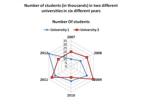
Number of students (in thousands) in two different universities in six different years
Number of Students

6. What was the difference between the number of students in university-1 in the year 2010 and the number of students in university-2 in the year 2012?
(1) Zero (2) 5,000
(3) 15,000 (4) 1,0000
(5) 1,000
7. What is the sum of number of students in university-1 in the year 2007 and the number of students in university-2 in the year 2011 together?
(1) 50,000 (2) 55000
(3) 45000 (4) 57000
(5) 40000
8. If 25% of the students in university-2 in the year 2010 were females, what was the number of male students in the university-2 in the same year?
(1) 11250 (2) 12350
(3) 12500 (4) 11500
(5) 11750
9. What was the percent increase in the number of students in University-1 in the year 2011 as compared to the previous year?
(1) 135 (2) 15
(3) 115 (4) 25
(5) 35
10. In which year was the difference between the number of students in university-1 and the number of students in univeisity-2 highest?
(1) 2008 (2) 2009
(3) 2010 (4) 2011
(5) 2012
Answers of Above Questions
6. (1) 7. (5) 8. (1) 9. (4) 10. (5)
Directions (Q. 1-5): Study the following radar graph carfully to answer the questions that follow: Number of seats won by various political parties in the legistative assemblies of different states
- The total number of seats won by the BSP is what per cent more or less than that by the Left parties in all states together?
1) 8.21% more
2) 7.69% less
3) 6.56% more
4) 9.71% less
5) 10% less
- What is the ratio of the total number of seats won by the BJP to the total number of seats won by the Congress in all states together?
1) 3 : 2
2) 4 : 5
3) 5 : 6
4) 6 : 7
5) 8 : 7
- If 30% seats of the Maharashtra legislative assembly are won by the females and 40% seats of the Gujarat legislative assembly are won by the females, then the male members of the Maharashtra legislative assembly are what per cent more or less than the male members of the Gujarat legislative assembly?
1) 2.08% more
2) 3.18% less
3) 4.28% more
4) 5.38% more
5) 6.48% less
- 40% members of the Haryana legislative assembly and 50% members of the UP legislative assembly are chargesheeted for involvement in crimes. Among these, 50% and 20% are females in the Haryana and UP legislative assembly respectively. Then the number of male members of the Haryana legislative assembly who are chargesheeted is what percentage more or less than the number of female members of the UP legislative assembly who are chargesheeted?
1) 250% more
2) 300% more
3) 142.85% more
4) 230% less
5) 220.45% less
- Which political party won the highest number of seats in the given eight states?
1) BSP
2) Left parties
3) Congress
4) BJP
5) Either BJP or BSP
Answers:
- 2
- 5
- 1
- 3
- 4
Directions (Q. nos. 1 to 5): Study the following radar graph carefully and answer the questions that follow.

1. What was the difference between the number of students in university 1 in the year 2010 and the number of students in university 2 in the year 2012?
(1) 0 (2) 5000 (3) 15000 (4) 10000 (5) 1000
2. What is the sum of the number of students in university 1 in the year 2007 and the number of students in university 2 in the year 2011 together?
(1) 50000 (2) 55000 (3) 45000 (4) 57000 (5) 40000
3. If 25% of the students in university 2 in the year 2010 were females, what was the number of male students in the university 2 in the same year?
(1) 11250 (2) 12350 (3) 12500 (4) 11500 (5) 11750
4. What was the per cent increase in the number of students in university 1 in the year 2011 as compared to the previous year?
(1) 135 (2) 15 (3) 115 (4) 25 (5) 35
5. In which year the difference between the number of students in university 1 and the number of students in university 2 highest?
(1) 2008 (2) 2009 (3) 2010 (4) 2011 (5) 2012
Correct answers are
1 (1) 2(5) 3(1) 4(4) 5(5)


