How to Solve Different Types Of Graph in DI Tips And Tricks
Data Interpretation is the calculation intensive portion of the quant section of mostly every competitive exam. The key to crack this area is to quickly identify the key pieces of data that you will require to work on the questions asked.
Data interpretation is the most scoring but time consuming section in competitive examinations. But If you understand carefully, Data Interpretation problems can be solved with little ease with some easy tricks. Here are some important techniques to make Data Interpretation calculations fast.
- The presentation of data is classified into various categories viz. Bar Graphs, Line Graphs, Pie Charts, Data Tables, Mixed Graphs, etc.
- Nearly all DI questions are founded upon these three chapters of Mathematics viz. Percentages, Averages and Ratios.
- All the questions (usually five) are solved from the given set of DI presentation.
We have also discovered that while solving the questions
- Understanding the various headings of DI table/graph/chart is very important.
- Data Interpretation depends upon the type of questions asked.
- Some questions are solved via reasoning process.
- And solving some questions helps solving the other questions.
This same process applies to every type of DI. In this article, we are covering the next type of Data Presentation, i.e. Line Graphs.
Introduction
Line Graph is the innovative version of Bar Graph representation. If we connect the upper point of the first Bar to the upper point of the second Bar and then tie these dots, we will get a line. Repeating the procedure gives us the Line Graph representation. Line graph and bar grapg r easy to comprehend. A Line Graph looks like this:
Sample Question
Following line graph shows the ratio of expenditure to income of three companies A, B and C during the period 2008–2013.

Reading the headings are important otherwise you will not be able to understand what these lines are all about.
Along Y-Axis are the ratios. Along X-Axis are the years. In between are the lines.
Following Line Graph shows the ratio of expenditure to income of three companies A, B and C.
Learn a few things from the heading:
- For Company A in 2008, if Expenditure is Rs 0.9, then Income will be Rs 1, and so on.
- It’s Expenditure to Income Ratio expressed as E:I and not Income to Expenditure.
- To have Profit, Expenditure is to be less than Income. Reverse is for Loss.
- Profit and Loss percentages are calculated using the formulas for the same.
- Profit = Income – Expenditure
- Profit Percentage = [Profit/Expenditure]*100
- Loss = Expenditure – Income
- Loss Percentage = [Loss/Expenditure]*100
- The lower is the E:I ratio, higher is the profit.
The questions of Expenditure and Income seem difficult to solve. But, let’s apply the above mentioned points to solve the questions in no time!
Steps to Solve
Question 1: In which of the following years is the percentage loss/profit of Company C the maximum?
[1] 2008
[2] 2009
[3] 2010
[4] 2011
From point no. 5, we conclude that profit is maximum when E:I is minimum which is 0.3 in 2011.
Hence answer is [4].
Question 2: If the expenditure of Company A in 2008 and 2009 together is Rs 60 lakhs, then what is its income in 2008 and 2009 together?
[1] Rs 120 lakhs
[2] Rs 150 lakhs
[3] Rs 66.66 lakhs
[4] Data inadequate
E:I for Company A in 2008 and 2009 is 0.5 and 0.4. This means for Rs 0.5 Expenditure in 2008, Income is Rs 1 in 2008 and for Rs 0.4 Expenditure in 2009, Income is Rs 1 in 2009. But combined Expenditure of 60 lakhs is given. So, ratios being different, it’s not possible to calculate the Income from the combined expenditure. Answer is [4].
Question 3: If the expenditure of Company B in 2008 and 2012 together is Rs 60 lakhs then what is its income in 2008 and 2012 together?
[1] Rs 66.66 lakhs
[2] Rs 75 lakhs
[3] Rs 48 lakhs
[4] 96 Rs lakhs
E:I for 2008 and 2012 is 0.8 and 0.8. Ratios being same, combined Income from the combined Expenditure can be calculated. Income = E/0.8 = 60/0.8 = 75 lakhs.
Answer is [2].
Question 4: In which of the years does Company C gain 100% profit?
[1] 2008
[2] 2009
[3] 2010
[4] 2011
For 100% profit, E:I ratio must be 0.5 so that I = E/0.5 = 2E. It’s in 2009.
Answer is [2]
Question 5: What is the percentage decrease in the percentage profit of Company C from 2009 to 2010?
[1] 75%
[2] 300%
[3] 62.5%
[4] 160%
E:I of Company C in 2009 = 0.5:1
Profit = 1-0.5 = 0.5
Percentage profit of profit of Company C in 2009 =[0.5/0.5]*100 = 100%
E:I of Company C in 2010 = 0.8:1
Profit = 1-0.8 = 0.2
Percentage profit of profit of Company C in 2009 =[0.2/0.8]*100 = 25%
Percentage decrease = 75%.
Answer is [1].
Tips to Solve Bar Graph Questions in DI
Data Interpretation is the calculation intensive portion of the quant section of mostly every competitive exam. The key to crack this area is to quickly identify the key pieces of data that you will require to work on the questions asked.
Data interpretation is the most scoring but time consuming section in competitive examinations. But If you understand carefully, Data Interpretation problems can be solved with little ease with some easy tricks. Here are some important techniques to make Data Interpretation calculations fast.
- The presentation of data is classified into various categories viz. Bar Graphs, Line Graphs, Pie Charts, Data Tables, Mixed Graphs, etc.
- Nearly all DI questions are founded upon these three chapters of Mathematics viz. Percentages, Averages and Ratios.
Bar Graphs
Introduction
In this article, we are discussing the Bar Graphs in a manner which is comparatively lucid. Don’t worry, the rest of the types we will cover in the upcoming articles. If you want to fully understand the techniques, you will have to pay attention to each and everything that’s been taught here.
Reading Bar Graphs
A bar graph looks like the following:

Along the X-axis (horizontal axis) we have some numbers. Along the Y-axis (vertical axis) we have some other numbers. And in between the area, we have some Bars. Try to understand the data that’s been presented here.
Finding it a bit difficult? Of course it’s difficult because you don’t know what these bars represents.
Now, try to understand the same bar chart, but with the headings.
Number of players participating in three different games from six different countries:

This won’t be difficult. From the above bar graph we conclude that:
- Three different bars represent three different games: Football, Cricket, and Badminton.
- On the X-axis, we have a number of countries from 1 to 6.
- On the Y-axis we have the number of players.
- The length of the Bars denotes the number of players.
CONCEPT 1: Before you solve any of the questions, first you have to understand what the Bar Graph is trying to say. Make a habit of scanning the headings first. You have to understand what’s on the X-axis, what’s on the Y-axis, what’s the relation between these two in terms of the length of Bars.There will be five questions based on one Bar Graph and that means you can get five full marks if and only if you understand the format of data that’s presented in the question. That’s what Data Interpretation actually means!!
Let’s proceed to solving five questions based upon this Bar Graph.
Sample Questions
Question 1: The number of players participating in Cricket from country–4 is what percentage of the number of players participating in Badminton from country–1?
[1] 177.77%
[2] 176.78%
[3] 178.87%
[4] 180.82%
CONCEPT 2: From this question we conclude that: data in Bar Graph tell us so many things. But it’s pointless to waste time interpreting all the data. It’s not necessary to know how many Football players or Badminton players are from Country-4 or from Country-6. Interpret what’s necessary!
Just point out Cricket players from Country-4 = 80 players. Number of Badminton players from Country-1 = 45 players. The rest is just the application of percentage formula.
Percentage = 80/45 * 100 = 177.77%
Question 2: What is the total number of players participating in Cricket from country 4, 5 and 6 and the number of players participating in Football from country 1, 2 and 3?
[1] 335
[2] 635
[3] 435
[4] 535
Applying Lesson number two, Number of Cricket players from Country 4, 5 and 6 = [80+70+60] = 210.
Number of Football players from Country 1, 2 and 3 = [65+70+90] = 225.
And 210+225 = 435
Question 3: The number of players participating in Badminton from all the country is what percentage of the total number of players participating in all the games from country–3?
[1] 134%
[2] 164%
[3] 126%
[4] 157%
Badminton players from all countries = [45+40+95+85+95+65] = 425. Total players from all games from Country-3 = [90+85+95] = 270. Required Percentage = [425/270]*100 ≈ 157%
Question 4: In which country is the number of players participating in Football is the highest and the number of players participating in Badminton is the lowest?
[1] Country 3 & 2
[2] Country 4 & 6
[3] Country 3 & 4
[4] Country 5 & 1
CONCEPT 3: These sort of questions are pretty easy to solve. Just interpret the data in your mind. Check the length of the Bars. The answer will surely come.
Football highest = 90 = Country-3 and Badminton lowest = 40 = Country-2
Question 5: 60% of players participating in all game from country-5 are male and 30% players participating in all game from country-3 are female. What will be their ratio?
[1] 127:170
[2] 13:7
[3] 49:27
[4] 87:55
Number of players from all games of Country-5 = [80+70+95] = 245. 60% of 245 = 147
Number of players from all games of Country-3 = [90+85+95] = 270. 30% of 270 = 81
Number of players from all games of Country-3: we already have calculated this number before in Question 3.
CONCEPT 4: Sometimes the calculation of one questions helps in the calculation of some other question.
In this question, the ratio is = 147:81 = 49:27
Tips & Tricks to solve Tabular Chart Questions in DI
Data interpretation is the most scoring but time consuming section in competitive examinations. But If you understand carefully, Data Interpretation problems can be solved with little ease with some easy tricks. Here are some important techniques to make Data Interpretation calculations fast.
How to solve Table Chart Questions
Introduction
Table chart is simplest method used for data. In a table, data is arranged systematically in columns and rows. The first row and the first column are generally used to indicate the titles. It is one of the easiest and most accurate way of presenting the data.
Important Points
- Read the data very carefully and try to understand what you are being asked to do. To prevent wasting time in calculation and find out what is required.
- Check the data and information carefully before jumping to answer the questions. Be sure you are looking at the right part of column and tables.
- Carefully check the units, Be sure you are taking same unit as you have given like in thousand, millions etc. A mistake in units and your answer may be different.
Sample Question
Direction: Refer to the following table and answer the given questions.
Number of cars sold by 6 Stores in 5 different months
The above Table shows:
- The number of cars sold by store P (In Jan = 133, Feb = 183, March = 278, April = 178, May = 264)
Like this we can see the others. Lets do solve some questions.
1. Number of cars sold by store T in march is what percent less then number of cars sold by Store P in may? (Rounded off to nearest integer)
(a) 29%
(b) 31%
(c) 37%
(d) 33%
Solution:
Number of cars sold by Store T in March = 178
Number of cars sold by store P in May = 264
Required percentage = (264 – 178 /264) * 100 (in question asked less then number that’s why we deducted) = (86/264) * 100 = 32.57%
So rounded figure it will be 33%, Answer D
2. What is the average number of cars sold by all the given stores in Feb?
(a) 207
(b) 211
(c) 219
(d) 223
Solution:
To find average we have to add all the figures of Feb month and then divided by 6
= 183 + 123 + 277 + 176 + 239 + 268 / 6 = 1266/6 = 211, Answer B
3. Total number of cars sold by store Q during all the given months together is what percent of the total number of cars sold by store S during all the given month together?
(a) 82%
(b) 88%
(c)92%
(d) 86%
Solution:
Total number of cars sold by store Q during all the given months together = 161 + 123 + 154 + 272 + 107 = 817
Total number of cars sold by store S during all the given months together = 225 + 176 + 98 + 284 + 167 = 950
Required percentage = (817/950) * 100= 86%, Answer D
4. What is the difference between total number of cars sold by all the given stores together in Jan and total number of cars sold by all the given stores together in April?
(a) 353
(b) 379
(c) 363
(d) 347
Solution:
Total number of cars sold by all the given stores together in Jan = 133 + 161 + 213 + 225 + 282 + 196 = 1210
Total number of cars sold by all the given stores together in April = 178 + 272 + 269 + 284 + 293 + 277 = 1573
Required difference = 1573 – 1210 = 363, Answer C
5. What is the respective ratio between total number of cars sold by stores P and R together in March and total number of cars sold by stores T and U together in May?
(a) 9:11
(b) 11:13
(c) 5:7
(d) 13:17
Solution:
Total number of cars sold by stores P and R together in March = 278 + 226 = 504
Total number of cars sold by stores T and U together in May = 379 + 237 = 616
Ratio= 504 : 616 = 9 : 11, Answer A
Tips & Tricks to solve Radar Chart Questions in DI
Data interpretation is the most scoring but time consuming section in competitive examinations. But If you understand carefully, Data Interpretation problems can be solved with little ease with some easy tricks. Here are some important techniques to make Data Interpretation calculations fast.
- The presentation of data is classified into various categories viz. Bar Graphs, Line Graphs, Pie Charts, Data Tables, Mixed Graphs, etc.
- Nearly all DI questions are founded upon these three chapters of Mathematics viz. Percentages, Averages and Ratios.
Radar Chart
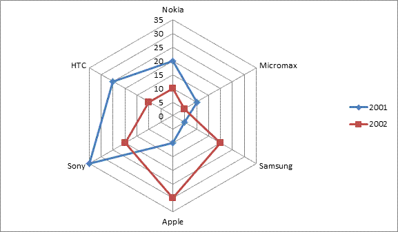
In this article, we are discussing the Radar Chart . Radar chart also known as a Spider Chart because its shape like spider and its has zero central point.
In this diagram, every value is represented with respect to a central point. All the changes in the values are expressed in the form of distance from the central point. Radar chart is not used for identifying the accuracy in data, but rather generalized relationships between data.
Sample Question:
In this question you have given number of mobile phones manufactured(in thousand) by 6 different companies in the years 2001 and 2002. Lets see this first from Table and Bar chart.
Number of mobile phones manufactured(in thousand) by 6 different companies in the years 2001 and 2002
Table chart

Bar chart
Radar Chart
We have seen the data through Table and Bar chart. Now we calculate this data through Radar chart.
Number of mobile phones manufactured(in thousand) by 6 different companies in the years 2001 and 2002

As you can see Blue lines indicate year 2001 and Red line indicates year 2002.
Let’s Solve the problems.
1. In 2002,Which company manufactured the maximum number of Mobile Phones?
(a) Nokia
(b) Sony
(c) Apple
(d) Samsung
Solution:
From the Chart you can clearly see the maximum number of Mobile Phones manufactured by Apple in 2002= 30,000 , Answer C
2. What is the average number of Mobile phones (in thousand) manufactured by all companies taken together in 2001?
(a) 17.5
(b) 18.5
(c) 20
(d) 22
Solution:
In 2001 Mobile manufactured,
Nokia= 20000, Micromax=10000, Samsung=5000, Apple= 10000, Sony=35000,HTC=25000
Total=20+10+5+10+35+25/6=105/6=17.5 Thousand, Answer A
3. The respective ratio between the number of Mobile Phones manufactured by Micromax in 2001 and that by Samsung in 2002 is ?
(a) 3 : 4
(b) 4 : 5
(c) 1 : 2
(d) 7 : 8
Solution:
The number of Mobile Phones manufactured by Micromax in 2001= 10000
The number of Mobile Phones manufactured by Samsung in 2002= 20000
Required Ratio= 10000 : 20000= 1 : 2, Answer C
4. The difference between the number of Mobile Phones manufactured by Nokia, Micromax and Samsung in 2001 and that by Apple , Sony and HTC in 2002 is ?
(a) 20000
(b) 30000
(c) 22000
(d) 25000
Solution:
The number of Mobile Phones manufactured by Nokia, Micromax and Samsung in 2001, = 20 +10 +5=35000
The number of Mobile Phones manufactured by Apple , Sony and HTC in 2002, =30 +20 +10=60000
Required difference= 60000-35000= 25000, Answer D
5. What is the percentage increase in production of Mobile Phones by Apple in 2001 in comparison to that in 2002?
(a) 200%
(b) 100%
(c) 300%
(d) 250%
Solution:
Production of Mobile Phones by Apple in 2001= 10
Production of Mobile Phones by Apple in 2002= 30
Percentage increase= 30-10/10 X 100% = 200%, Answer A
Tips & Tricks to solve Combination Chart Questions in DI
Combination chart or Mixed Graph because it contains more than one chart sometimes three.
Generally, questions asked from this chapter are based on the combinations as follows:
Combination chart
- Table and Line Graph: In this type of graph we are given a Line graph and a Table Graph and we have to solve the questions using the information given in both graphs together.
- Table and Bar Graph: In this type of graph we are given a Bar graph and a Table Graph and we have to solve the questions using the information given in both graphs together.
- Table and Pie chart: In this type of graph we are given a Pie Chart(circular chart) and a Table Graph and we have to solve the questions interpreting the data given in both graphs together.
- Bar graph and Pie chart: In this type of graph we are given a Pie Chart(circular chart) and a Bar Graph and we have to solve the questions interpreting the data given in both graphs together.
- Pie chart and Line Graph: In this type of graph we are given a Pie Chart(circular chart) and a Line Graph and we have to solve the questions interpreting the data given in both graphs together.
- Bar graph and Line Graph: In this type of graph we are given a Bar Graph and Line Graph and we have to solve the questions interpreting the data given in both graphs together.
Sometimes it looks complicated but it’s not like that if use the information given in graphs correctly we can solve the questions easily.
Sample Question:
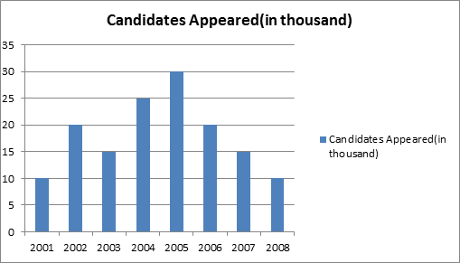
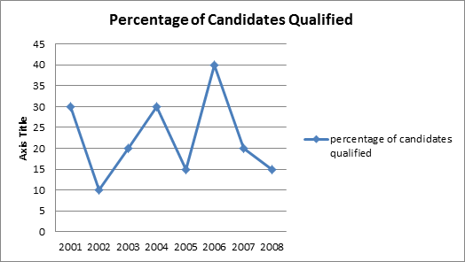
Number of candidates appeared (in thousand) and percentage of candidates qualified in a competitive examination over the years(in thousand)
Here we have given two charts one is Bar Chart which shows the candidates appeared in examination and other graph is Line graph which shows percentage of qualified candidate in this examination.
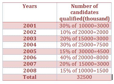
Before solve the questions we will do one thing. We will draw a table and will get the number of candidates who are qualified. After that it will be easy for us to solve the questions. Let’s do that.
1. In which of the following years, was the number of candidates qualified the lowest among the given years?
(a) 2007
(b) 2008
(c) 2004
(d) 2005
Solution: Above the table we can see that number of candidates qualified the lowest in 2008=1500,Answer B
2. What was the ratio between the number of candidates appeared in 2001 to appeared in 2006?
(a) 3 : 4
(b) 5 : 6
(c) 1 : 2
(d) 7 : 8
Solution:
The number of candidates appeared in 2001= 10000
The number of candidates appeared in 2006= 20000
Required ratio= 10000 : 20000= 1 : 2, Answer C
3. How many candidates qualified in the year 2004 ?
(a) 7500
(b) 4500
(c) 3000
(d) 2000
Solution: Above the table we can see that number of candidates qualified in 2004 is = 7500, Answer A
4. The number of candidates qualified in 2003 was what percent of the number of candidates appeared in 2007?
(a) 10%
(b) 30%
(c) 40%
(d) 20%
Solution:
The number of candidates qualified in 2003=3000
The number of candidates appeared in 2007=15000
Required percentage= 3000/15000 X 100= 20%, Answer D
5. What was the total number of candidates qualified over the years?
(a) 35000
(b) 33500
(c) 40000
(d) 32500
Solution: Above table we can see that total number of candidates qualified, =3000 + 3000 +2000+ 7500 + 4500 + 8000+ 3000 + 1500 =32500, Answer D


