
Line Graph DI Tricks & Tips
Line Graph DI (Data Interpretation) Short-Cut Tricks & Tips : Line Graph DI (Data Interpretation) Short-Cut Tricks & Tips Question Pdf for Banking, SSC, RRB, FCI, Railway, UPSC, State PCS, Insurance & other Competitive exams. Line Graph DI (Data Interpretation) Short-Cut Tricks & Tips shortcut Tricks Pdf, Line Graph DI (Data Interpretation) Short-Cut Tricks & Tips MCQ, Line Graph DI (Data Interpretation) Short-Cut Tricks & Tips Objective Question & Answer Pdf. “Line Graph DI (Data Interpretation) Short-Cut Tricks & Tips Questions PDF” In this post we are providing you the Line Graph DI (Data Interpretation) Short-Cut Tricks & Tips pdf with detailed solution & Short Tricks. So that you can easily get the logic of question. This Line Graph DI (Data Interpretation) Short-Cut Tricks & Tips Pdf we are Providing is free to download. ” Most Important Line Graph DI (Data Interpretation) Short-Cut Tricks & Tips Question PDF with Answers“
Line Graph DI (Data Interpretation) Short-Cut Tricks & Tips Plays a vital role in Exam. In every exam you will get at least 5-10 questions from this topic. So candidates must focus on this topic and download this Line Graph DI (Data Interpretation) Short-Cut Tricks & Tips pdf to get important questions with best solution regarding Line Graph DI (Data Interpretation) Short-Cut Tricks & Tips. We have put all Previous Year Questions of Line Graph DI (Data Interpretation) Short-Cut Tricks & Tips that are Asked in various Govt & Private Exam.
Let us look at a shortcut method to solve a certain type of line graph problems using an example. If we attempt to solve it with complete complicated calculations, we will end up wasting a lot of precious time. Remember that the examiners don’t expect you to solve everything on paper. They want to see if you are capable of applying your logic to evaluate the graph, eliminate options, and arrive at the answer through estimation.
Once you master this technique, we will, in subsequent articles, deal with more complicated sets of line graphs.
Line Graphs
Line graph represents data in the form of straight lines that connect various data values. Both line graphs and bar graphs are used to convey same things and hence can be used inter-changeably. For example, a line graph can be generated by joining the tip of the bar graph.
| Positives | Negatives |
|---|---|
| 1. Trends can be even better established in Line graphs than Bar graphs. | 1. It has a similar disadvantage as the Bar graph in terms of establishing the exact values |
| 2. Questions pertaining to percentage change and growth rates become easier to solve using line graphs. | 2. Line graphs can only indicate the value at the end of a certain period and not between any two values./td> |
Shortcuts to crack DI sets containing Line Graphs
1. Use the advantage of looking at slope of the line in questions pertaining to growth rates.
Let us have a look at this CAT 2003 (Nov) example to drive home the point.

The growth rate or the decline rate is calculated as the growth or the decline as a percentage of the initial value. For this rate to be highest, the growth or the decline has to be the highest on a very small initial value. While for this rate to be the lowest, the growth or the decline has to be the lowest on a very high initial value.
For the first question, we need to compare the values pertaining to the ‘0th month’ and the ‘2nd month’. Now looking at the slope (steepness) of the graph, it is clear that the answer is Geeta. For her the growth is the highest and that has happened on a very small initial value.
For the second question, we need to compare values pertaining to the ‘0th month’ and the ‘5th month’. Again, it is very clear that the answer is Shyam. The growth is the least in his case and that too on a very high initial value.
2. Beware that in a Line graph you can only know value at the end of a certain time period and not the values in between two time periods.
Here is a CAT 2003 (Feb) set to understand this.

In the above graph, how many times during the given time period do you think was the price of Rice and Onion the same?
From the graph, it seems like 3, because the two graphs intersect thrice – once between 96 and 97, once between 98 and 99 and once at 2000. However, we can only be sure about the year 2000. What is important to know is that the line graph can only show the values at the end of a particular time period (in this case ‘year’). We can never comment what happened in between two years. For example, at the end of 1996, the price of Rice was Rs.12/kg and at the end of 1997 it was Rs.10/kg. Similarly, the price of Onion was Rs.10/kg and Rs.18/kg between these two time periods. We had to join these two points by a straight line, and they intersect at a point (in this case at Rs.11/kg). This is no way indicates that the prices of these two commodities had been Rs.11/kg between 1996 and 1997.
Example of Line Graph Problems
Directions: Study the following line graph carefully and give answers to questions that follow.
Total number of males and females in five different companies
Ques: The number of females from company A is approximately what percent of the total number of females in all the companies put together?
1) 21
2) 17
3) 23
4) 19
5) 15
Ans: 5) 15
Solution:
There are different approaches to find out the answer to this question.
First Approach:
We can simply take all values and calculate the answer. i.e. we will have to find out (females in A)/(Total females). This would be the long method. If we solve it at leisure, we could get an accurate answer. But given the time crunch we face during the exam, we are likely to commit errors.
Second Approach:
This approach rests on the assumption of blocks. It simplifies our calculations significantly.
Here In this graph, we assume 1 block to be equivalent to 500 employees each. So with this assumption, we can see that females in Company A would be 5.5 blocks. Similarly females in in Company B would be 8 blocks and so on.
We can use approximations as follows to arrive at the above:
≈15%
Note that you could do these calculations quickly, if you know how to quickly convert fractions to percentages. We learnt this trick in the Time & Work article previously.
Third Approach:
Let us assume the number of females in each company is equal. Assuming there are 10 females in each company, we can simply state the answer as
Similarly, if there were 100 females then our answer would still remain 100/500 = 1/5 = 20%.
So, if we assume females are equal in each company then it does not depend on how many females there actually are, but on how many companies there are. So clearly, when the number of females in each company is equal, they become equal to the average.
In reality they are not equal but some deviation from the average.
We can solve this by estimating where the average line would lie on the graph. Plot the average line by drawing the best fit line – a line that passes through or close to as many relevant points in the graph so that there are as many points on side of this line as there are on the other, with all points being as close to the line as possible.
In the given problem, we have five companies and so our average is 20%. We can see from the graph that A is below the average line. So clearly, the number of females in the A would be less than 20%.
So, options 1 and 3 are ruled out.
We see that there is one other company with fewer female employees than the average i.e. company E. However E has females close to our assumed average i.e. 20%. Looking at E, we can see that it is closer to 19%.
Looking at E, we can say that A can therefore not be 19%.
Now the difference between E and A is significant, so we can eliminate A being 17% as well.
However, we can clearly estimate that A is 15%.
This method is not foolproof and won’t work when we have several options that are very close to each other. The explanation for this method is also somewhat lengthy. However, when solving a problem with a good spread in options, this method will allow you to solve line graph problems in a matter of less than 10 seconds. This is because you need not solve anything, just estimate.
Important Concepts and Tips Solve Data Interpretation (Line Graph) Problems:
QUESTION:
Directions ( 1 – 5 ):Study the following Graph carefully and answer the questions given below :
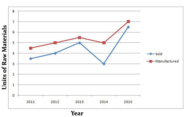
Units of Raw Material Manufactured and Sold by a Company Over the Years ( Units in Crores )
- What is the average number of units sold over the years ?
- a)440000000
- b)4400000
- c)440000
- d)44000000
- e)None of these
- What is the respective ratio of the difference between the number of units manufactured and sold in the year 2013 to the difference between the number of units manufactured and sold in the year 2014 ?
- a)2 : 3
- b)1 : 2
- c)1 : 4
- d)3 : 5
- e)None of these
- What is the respective ratio of the number of units manufactured in the year 2011 to the number of units manufactured in the year 2015 ?
- a)7 : 11
- b)9 : 14
- c)7 : 9
- d)9 : 11
- e)None of these
- What is the approximate percent increase in the number of units sold in the year 2015 from the previous year ?
- a)190
- b)70
- c)60
- d)95
- e)117
- What is the difference between the number of units manufactured and the number of units sold over the years?
- a)50000000
- b)5000000
- c)500000000
- d)500000
- e)None of these
SOLUTION:
Ans :(4) 44000000
QUESTION 2:EXPLANATION
STEP 1 : Number of units manufactured and sold in the year 2013
= ( 5.5 – 5 ) crore
= 0.5 crore
STEP 2 : Number of units manufactured and sold in the year 2014
= ( 5 – 3 ) crore
= 2 crore
Required ratio = 0.5 : 2
= 5 : 20
= 1 : 4
Ans :(3) 1 : 4
QUESTION 3 : EXPLANATION
STEP 1 :Required ratio = 4.5 : 7
= 45 : 70
= 9 : 14
Ans :(2) 9 : 14
QUESTION 4 : EXPLANATION
STEP 1 : Increase = 6.5 – 3
= 3.5 crore
STEP 2 : Increase % = 35 / 3 x 100 = 117
Ans :(5) 117
QUESTION 5 : EXPLANATION
STEP 1 : Number of sold units = 22 crore
STEP 2 : Number of manufacturing units = ( 4.5 + 5 + 5.5 + 5 + 7 ) crore
= 27 crore
STEP 3 : Required Difference = ( 27 – 22 ) crore
= 5 crore
= 50000000
Ans :(1) 50000000
Line Graph is the innovative version of Bar Graph representation. If we connect the upper point of the first Bar to the upper point of the second Bar and then tie these dots, we will get a line. Repeating the procedure gives us the Line Graph representation. Line graph and bar graph are easy to comprehend. A Line Graph looks like this:

Important Points: While solving the line chart questions, some points are very crucial to note these are as follows:
- Understanding the various headings of DI table/graph/chart is very important.
- Data Interpretation depends upon the type of questions asked.
- Some questions are solved via reasoning process.
- And solving some questions helps solving the other questions.
Let’s understand this with the help of few Examples:
Example 1
Following line graph shows the ratio of expenditure to income of three companies A, B and C during the period 2008–2013.

As mentioned above – Reading the headings are important otherwise you will not be able to understand what these lines are all about.
Please observe that – Along Y-Axis are the ratios; Along X-Axis are the years; In between are the lines.
Following Line Graph shows the ratio of expenditure to income of three companies A, B and C.
Learn a few things from the heading:
(1) For Company A in 2008, if Expenditure is Rs 0.9, then Income will be Rs 1, and so on.
(2) It’s Expenditure to Income Ratio expressed as E:I and not Income to Expenditure.
(3) To have Profit, Expenditure is to be less than Income. Reverse is for Loss.
(4) Profit and Loss percentages are calculated using the formulas for the same.
- Profit = Income – Expenditure
- Profit Percentage = [Profit/Expenditure]*100
- Loss = Expenditure – Income
- Loss Percentage = [Loss/Expenditure]*100
(5) The lower is the E:I ratio, higher is the profit.
The questions of Expenditure and Income seem difficult to solve. But, let’s apply the above mentioned points to solve the questions in no time!
Steps to Solve
Question 1: In which of the following years is the percentage loss/profit of Company C the maximum?
[1] 2008
[2] 2009
[3] 2010
[4] 2011
[5] 2012
Hint: From point no. 5, we conclude that profit is maximum when E:I is minimum which is 0.3 in 2011.
Hence answer is [4].
Question 2: If the expenditure of Company A in 2008 and 2009 together is Rs 60 lakhs, then what is its income in 2008 and 2009 together?
[1] Rs 120 lakhs
[2] Rs 150 lakhs
[3] Rs 66.66 lakhs
[4] Data inadequate
[5] None of these
Hint: E:I for Company A in 2008 and 2009 is 0.5 and 0.4. This means for Rs 0.5 Expenditure in 2008, Income is Rs 1 in 2008 and for Rs 0.4 Expenditure in 2009, Income is Rs 1 in 2009. But combined Expenditure of 60 lakhs is given. So, ratios being different, it’s not possible to calculate the Income from the combined expenditure. Answer is [4].
Question 3: If the expenditure of Company B in 2008 and 2012 together is Rs 60 lakhs then what is its income in 2008 and 2012 together?
[1] Rs 66.66 lakhs
[2] Rs 75 lakhs
[3] Rs 48 lakhs
[4] 96 Rs lakhs
[5] Data inadequate
Hint: E:I for 2008 and 2012 is 0.8 and 0.8. Ratios being same, combined Income from the combined Expenditure can be calculated. Income = E/0.8 = 60/0.8 = 75 lakhs.
Answer is [2].
Question 4: In which of the years does Company C gain 100% profit?
[1] 2008
[2] 2009
[3] 2010
[4] 2011
[5] None of these
Hint: For 100% profit, E:I ratio must be 0.5 so that I = E/0.5 = 2E. It’s in 2009.
Answer is [2]
Question 5: What is the percentage decrease in the percentage profit of Company C from 2009 to 2010?
[1] 75%
[2] 300%
[3] 62.5%
[4] 160%
[5] None of these
Hint: E:I of Company C in 2009 = 0.5:1
Profit = 1-0.5 = 0.5
Percentage profit of profit of Company C in 2009 =[0.5/0.5]*100 = 100%
E:I of Company C in 2010 = 0.8:1
Profit = 1-0.8 = 0.2
Percentage profit of profit of Company C in 2009 =[0.2/0.8]*100 = 25%
Percentage decrease = 75%.
Answer is [1].
Line Chart Questions Answers
The following Line chart gives the ratio of the amounts of imports by a Company to the amount of exports from that Company over the period from 1995 to 2001. Answer the following questions based on following Line graph.

-
1. In how many of the given years were the exports more than imports ?
- 1
- 2
- 3
- 4
Answer :
Option D
Explanation:
Clearly the exports are more than the imports implies that the ratio of value of imports to exports in less than 1.
So years are 1995, 1996, 1997 and 2000. So these are four years -
2. The imports were minimum proportionate to the exports of the Company in the year :
- 1997
- 1995
- 1996
- 2000
Answer :
Option A
Explanation:
Clearly from the line graph we can judge it is minimum in year 1997.
-
3. If the imports of a company in 1996 was Rs. 272 crores, the exports from the company in 1996 was:
- Rs 120 Crores
- Rs 220 Crores
- Rs 320 Crores
- Rs 420 Crores
Answer :
Option C
Explanation:
We are given with the ratio of imports and exports in the line graph.
Let the exports from the company in 1996 was x
then,
272/x = 0.85
=> x = 272/0.85
=> x = 320Note: Please not that we are given the ratio of imports to exports, so export will in denominator .
-
4. What was the percentage increase in imports from 1997 to 1998 ?
- 70
- 72
- 74
- Data Inadequate
Answer :
Option D
Explanation:
For calculating the percentage we will need value of exports, imports etc. We are only given with the ratio. So data in Inadequate.
Note: Please note in charts questions, most probably it includes 1 or more than 1 questions which are percentage based. So please clear percentage questions before preparing it. Because this is very scoring section.
-
5. If the imports in 1998 was Rs. 250 crores and the total exports in years 1998 and 1999 together was Rs 500 crores, then the imports in 1999 was :
- 320 Crore
- 420 Crore
- 520 Crore
- 620 Crore
Answer :
Option B
Explanation:
The Ratio of imports to exports for the years 1998 and 1999 are 1.25 and 1.40 respectively.
Let the exports in the year 1998 = Rs. x crores
Then,the exports in the year 1999 = (500-x) crores=> 1.25 = 250/x [because 1.25 is 1998 ratio]
=> x = 250/1.25 = 200 crore
Thus the exports in the year 1999 were 500 – 200
= 300 croreLet the imports in the year 1999 = Rs y crore
Then 1.40 = y/300
=> y = 1.40*300 = 420 crore
Study the following line graph and answer the questions based on it.

-
1. What is the difference between the two companies in the given years ?
- 16000
- 26000
- 28000
- 30000
Answer :
Option B
Explanation:
Please note that line graph values are given in thousands.
Total production of Company X from 1997 to 2002 =
119000+99000+141000+78000+120000+159000 = 716000Total production of Company Y from 1997 to 2002 =
139000+120000+100000+128000+107000+148000 = 742000Difference = 742000 – 716000
= 26000 -
2. What is the difference between the numbers of vehicles manufactured by Company Y in 2000 and 2001 ?
- 21000
- 22000
- 23000
- 24000
Answer :
Option A
Explanation:
Required Difference = 128000-107000 = 21000
-
3. What is the average number of vehicles manufactured by Company X over the given period ?
- 119133
- 119233
- 119333
- 119433
Answer :
Option C
Explanation:
Average number of vehicles manufactured by Company X
= 16(119000+99000+141000+78000+120000+159000)
= 119333 -
4. In which of the following years, the difference between the productions of Companies X and Y was the maximum among the given years ?
- 1800
- 1875
- 1900
- 2000
Answer :
Option D
Explanation:
Although if we have deep look on line chart the nwe can judge that it was in year 2000
Lets also solve it,For 1997 = (139000 – 119000) = 20000
For 1998 = (120000 – 99000) = 21000
For 1999 = (141000 – 100000) = 41000
For 2000 = (128000 – 78000) = 50000
For 2001 = (120000 – 107000) = 13000
For 2002 = (159000 – 148000) = 11000Clearly the difference was maximum in year 2000.
-
5. The production of Company Y in 2000 was approximately what percent of the production of Company X in same year ?
- 163%
- 164%
- 165%
- 166%
Answer :
Option B
Explanation:
Required Percentage =(12800078000∗100)%=164.1%Required Percentage =(12800078000∗100)%=164.1%Which is approximately 164%
Answer the questions based on line graph given below.

-
1. In how many of the given years were the exports more than the imports for Company A ?
- 1
- 2
- 3
- 4
Answer :
Option C
Explanation:
If ratio of export to import is greater than 1, it means the export was more than the import.
So For company A, in years 1995, 1996 and 1997 ratio was more than 1, so there are 3 such years. -
2. In which year was the difference between the imports and exports was the maximum for company B?
- 1996
- 1997
- 1998
- Can not be determined
Answer :
Option D
-
3. If the exports of company A in 1998 were Rs 237 crores, what was the amount of imports in that Year ?
- 216 crores
- 316 crores
- 416 crores
- 516 crores
Answer :
Option B
Explanation:
We are having the ratio of exports to imports.
Exports are given for 1998 for company A
So as per line chart in 1998 for company A,237/x = 0.75
=> x = 237/0.75 = 316 crores -
4. If the imports of Company A in 1997 were increased by 40 percent, what would be the ratio of exports to the increased imports ?
- 0.25
- 1.15
- 1.25
- 1.35
Answer :
Option C
Explanation:
In 1997 for company A, we have
let export be E and Import be IEI=1.75=>E=1.75INew Imports Inew=40%=1.4INew ratio =EInew=1.75I1.4I=1.25ofIEI=1.75=>E=1.75INew Imports Inew=40%ofI=1.4INew ratio =EInew=1.75I1.4I=1.25 -
5. In 1995, the export of the company A was double that of company B. If the imports of Company A during the year was Rs 180 crores, what was the approximate amount of imports of Company B during that year ?
- 110 crores
- 210 crores
- 310 crores
- 410 crores
Answer :
Option B
Explanation:
In 1995 for Company A we haveEAIA=1.75In 1995 for Company Bwe haveEBIB=0.75Also, we haveEA=2EBIA=180croresfrom(i)EA=180∗1.75=315croresfrom(iii)EB=EA2=3152croresfrom(ii)IB=EB0.75=3152∗0.75=210crores
Study the following line graph which gives the number of students who joined and left the school in the beginning of the year for six years from 1996 to 2001.
Initial strength of the school in 1995 was 3000
Answer questions based on the line graph given below.

-
1. The strength of the school increased from 1997 to 1998 by what percent ?
- 1.7%
- 1.8%
- 1.9%
- 2%
Answer :
Option A
Explanation:
Let analyse the graph before answering question.
Number of students in 1995 = 3000 [given]
Number of students in 1996 = 3000-250+350 = 3100
Number of students in 1997 = 3100-450+300 = 2950
Number of students in 1998 = 2950-400+450 = 3000
Number of students in 1999 = 3000-350+500 = 3150
Number of students in 2000 = 3150-450+400 = 3100
Number of students in 2001 = 3100-450+550 = 3200Above analysis will help us solving problems for this line graph.
Lets be back on question now,
Percentage increase in strength of the school from 1997 to 1998 will be,
((3000−2950)2950∗100)%=1.69%((3000−2950)2950∗100)%=1.69%((3000−2950)2950∗100)%=1.69%So this is approx equal to 1.7%
-
2. The number of students studying in the school during 1999 was :
- 3100
- 3000
- 3150
- 3250
Answer :
Option C
Explanation:
Number of students in 1995 = 3000 [given]
Number of students in 1996 = 3000-250+350 = 3100
Number of students in 1997 = 3100-450+300 = 2950
Number of students in 1998 = 2950-400+450 = 3000
Number of students in 1999 = 3000-350+500 = 3150 -
3. During which of the following pairs of years, the strength of the school was same ?
- 1997 and 1998
- 1998 and 2000
- 1999 and 2001
- 1996 and 2000
Answer :
Option D
Explanation:
Number of students in 1995 = 3000 [given]
Number of students in 1996 = 3000-250+350 = 3100
Number of students in 1997 = 3100-450+300 = 2950
Number of students in 1998 = 2950-400+450 = 3000
Number of students in 1999 = 3000-350+500 = 3150
Number of students in 2000 = 3150-450+400 = 3100
Number of students in 2001 = 3100-450+550 = 3200From from above options we find in 1996 and 2000 number of students was same i.e. 3100
-
4. The number of students studying in the school in 1998 was what percent of the number of students studying in the school in 2001 ?
- 90.75%
- 91.75%
- 92.75%
- 93.75%
Answer :
Option D
Explanation:
Number of students in 1995 = 3000 [given]
Number of students in 1996 = 3000-250+350 = 3100
Number of students in 1997 = 3100-450+300 = 2950
Number of students in 1998 = 2950-400+450 = 3000
Number of students in 1999 = 3000-350+500 = 3150
Number of students in 2000 = 3150-450+400 = 3100
Number of students in 2001 = 3100-450+550 = 3200In 2001 students = 3200
In 1998 students = 3000Required Percentage =(30003200∗100)%=93.75%Required Percentage =(30003200∗100)%=93.75% -
5. Among the given years the largest number of students joined in which year ?
- 1999
- 2000
- 2001
- 1998
Answer :
Option C
Explanation:
Clearly from the line graph we can judge it was in year 2001.
-
6. For which year, the percentage rise/fall in the number of students who left the school compared to previous years is maximum ?
- 1997
- 1998
- 1999
- 2000
Answer :
Option A
Explanation:
Please note we are calculating the percentage rise/fall of number of students left.
for 1997=[(450−250)250∗100]%=80%(rise)for 1998=[(450−400)450∗100]%=11.11%(fall)for 1999=[(400−350)350∗100]%=28.57%(rise)for 2000=[(450−350)350∗100]%=28.57%(rise)for 1997=[(450−250)250∗100]%=80%(rise)for 1998=[(450−400)450∗100]%=11.11%(fall)for 1999=[(400−350)350∗100]%=28.57%(rise)for 2000=[(450−350)350∗100]%=28.57%(rise)So it was maximum in 1997
-
7. The ratio of the least number of students who joined the school to the maximum number of students who left the school in any of the years during the given period is:
- 1:2
- 2:3
- 3:5
- 3:7
Answer :
Option B
Explanation:
Required Ratio =300450=23=2:3
Exercise Questions
The following line graph gives the percent profit earned by two Companies X and Y during the period 1996 – 2001.
Percentage profit earned by Two Companies X and Y over the Given Years,
%Profit = (Income – Expenditure)/Expenditure * 100

1. The incomes of two Companies X and Y in 2000 were in the ratio of 3:4 respectively. What was the respective ratio of their expenditures in 2000 ?
a. 7 : 22
b. 14.19
c. 15:22
d. 27:35
2. If the expenditure of Company Y in 1997 was Rs. 220 crores, what was its income in 1997?
a. Rs.312 crores
b. Rs.297 crores
c. Rs.283 crores
d. Rs.275 crores
3. If the expenditures of Company X and Y in 1996 were equal and the total income of the two Companies in 1996 was Rs. 342 crores, what was the total profit of the two Companies together in 1996 ? (Profit = Income – Expenditure)
a. Rs.240 crores
b. Rs.171 crores
c. Rs.120 crores
d. Rs.102 crores
4. The expenditure of Company X in the year 1998 was Rs.200 crores and the income of company X in 1998 was the same as its expenditure in 2001. The income of Company X in 2001
was ?
a. Rs.465 crores
b. Rs.385 crores
c. Rs.335 crores
d. Rs.295 crores
5. If the incomes of two Companies were equal in 1999, then what was the ratio of expenditure of Company X to that of Company Y in 1999 ?
a. 6:5
b. 5:6
c. 11:6
d. 16:15
Study the following line graph and answer the questions based on it.
Number of Vehicles Manufactured by Two companies over the Years (Number in Thousands)

6. What is the difference between the number of vehicles manufactured by Company Y in 2000 and 2001 ?
a. 50000
b. 42000
c. 33000
d. 21000
7. What is the difference between the total productions of the two Companies in the given years ?
a. 19000
b. 22000
c. 26000
d. 28000
8. What is the average numbers of vehicles manufactured by Company X over the given period ? (rounded off to nearest integer)
a. 119333
b. 113666
c. 112778
d. 111223
9. In which of the following years, the difference between the productions of Companies X and Y was the maximum among the given years ?
a. 1997
b. 1998
c. 1999
d. 2000
10. The production of Company Y in 2000 was approximately what percent of the production of Company X in the same
year ?
a. 173
b. 164
c. 132
d. 97
Answer Key
1.c; 2.b; 3.d; 4.a; 5.d; 6.d; 7.c; 8.a; 9.d; 10.b


 for All Posts 2025 – Check Now")

 – Railway NTPC Cutoff Marks")


